

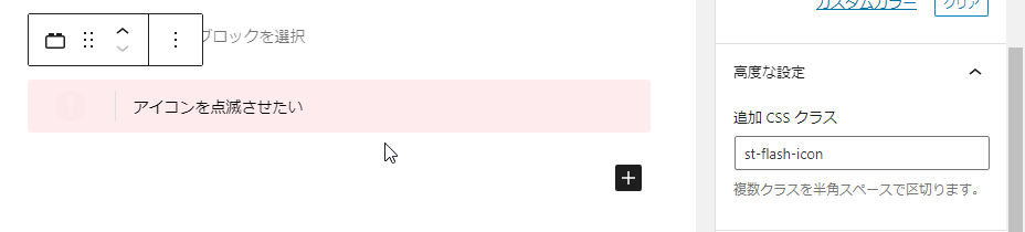
「追加CSSクラス」に記載することでアニメーションや個別のCSSを適応するクラスです。
CSSクラス表
| アニメーション | 全体 | アイコン |
|---|---|---|
| 45°揺れ | st-wrench animated | st-wrench-icon |
| ベル揺れ | st-ring animated | st-ring-icon |
| 横揺れ | st-horizontal animated | st-horizontal-icon |
| 縦揺れ | st-vertical animated | st-vertical-icon |
| 点滅 | st-flash animated | st-flash-icon |
| バウンド | st-bounce animated | st-bounce-icon |
| 回転 | st-rotation animated | st-rotation-icon |
| ふわふわ | st-float animated | st-float-icon |
| 大小 | st-pulse animated | st-pulse-icon |
| シェイク | st-shake-s animated | st-shake-s-icon |
| シェイク(強) | st-shake animated | st-shake-icon |
| 拡大(ゆれ) | st-tada animated | st-tada-icon |
| 過ぎる | st-passing animated | st-passing-icon |
| 戻る | st-passing-reverse animated | st-passing-reverse-icon |
| バースト | st-burst animated | st-burst-icon |
| 落ちる | st-falling animated | st-falling-icon |
「追加 CSS クラス」に既に記載がある場合は消さずに半角スペースを空けて記載するように注意して下さい。
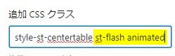
※上図は予め「is-style-st-centertable」の記載があるブロックに「st-flash animated」を追加した例です。
サンプル
以下は「STINGER: メモブロック」にアイコン用のアニメーションクラスを適応した場合の例です。
特殊クラス(β)
追加CSSなどに記載することで利用できる補助的なβクラスです(ver20230120以降のものも含まれます)。
※あくまでも補助的なものとなり、使用箇所や状況によっては反映されない場合やレイアウトが崩れる場合もございます。
※クラス名は削除又は変更になる場合がございます
| CSSクラス | 適応されるCSS |
|---|---|
| pa0 | padding: 0px!important; |
| ma0 | margin: 0px!important; |
| mt0 | margin-top: 0px!important; |
| mt10 | margin-top: 10px!important; |
| mt20 | margin-top: 20px!important; |
| mt30 | margin-top: 30px!important; |
| mt-10 | margin-top: -10px!important; |
| mt-20 | margin-top: -20px!important; |
| mt-30 | margin-top: -30px!important; |
| mb0 | margin-bottom: 0!important; |
| mb10 | margin-bottom: 10px!important; |
| mb-10 | margin-bottom: -10px!important; |
| mb-20 | margin-bottom: -20px!important; |
| noradius | border-radius: 0!important; |
| radius10 | border-radius: 10!important; |
| radius20 | border-radius: 20!important; |
| radius30 | border-radius: 30!important; |
| center | text-align: center; |
| sp-center | text-align: center;(※599px以下のみ) |
| st-opacity | opacity: 0.8; |
| st-cover | 要素を選択不可に |
| st-reflection-on | 光る演出 |
| gap-0 | gap: 0!important; |
| scroll-x | カラムブロックを横スクロール(カラムブロックのみ) |
| scroll-x.w50 | カラムブロックを2列で横スクロール(カラムブロックのみ) |
| st-notosans | font-family: 'Noto Sans JP', sans-serif!important; |
| st-m1c | font-family: 'M PLUS Rounded 1c', sans-serif!important; |
| st-box-shadow | ドロップシャドウを追加 |
| kanren | 「関連」ラベル ※埋込URL(ブログカード)専用 |
| popular | 「人気」ラベル ※埋込URL(ブログカード)専用 |
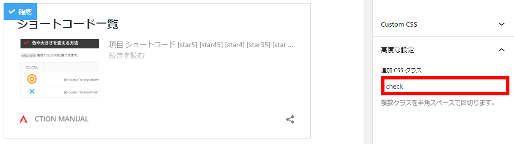
| check | 「確認」ラベル ※埋込URL(ブログカード)専用 |
| important | 「重要」ラベル ※埋込URL(ブログカード)専用 |
指定 ブロック専用
| bound | 少し動かす | 会話ふきだし |
| stop | 少し動かすを止める | 会話ふきだし |
| kome | 「※」マークにする | リスト |
| pc | 「スクロールする」有効時にPC閲覧時にも適応 | テーブル |
| h-100 | 高さを100%にする | カバー |
| kanren | 「関連」ラベル | 埋込URL(ブログカード) |
| popular | 「人気」ラベル | 埋込URL(ブログカード) |
| check | 「確認」ラベル | 埋込URL(ブログカード) |
| important | 「重要」ラベル | 埋込URL(ブログカード) |
補助的な装飾スタイルとなります。段落スタイルなどブロックやデザインによっては正常に反映されない場合がございますのでご了承下さいませ。

![SUGOI MOKUJI(すごいもくじ)[PRO] - 【公式】STINGER STORE](https://s.wordpress.com/mshots/v1/https%3A%2F%2Fon-store.net%2Faf_sugoimokuji%2F?w=300&h=300 "SUGOI MOKUJI(すごいもくじ)[PRO] - 【公式】STINGER STORE")